Brand identity

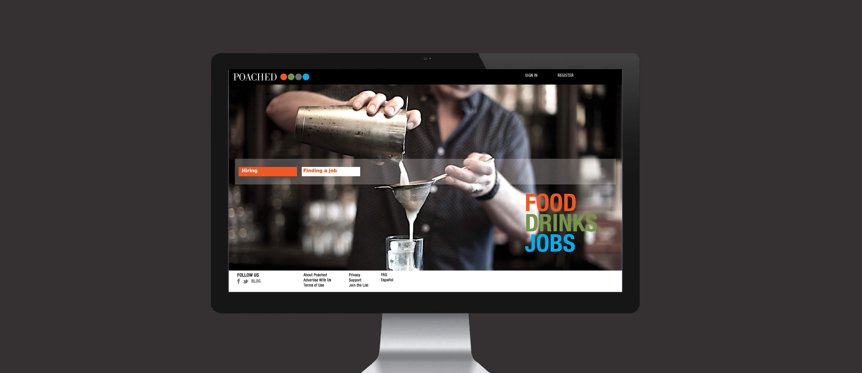
Build a jobs site focused on the Food and Drink Industry.
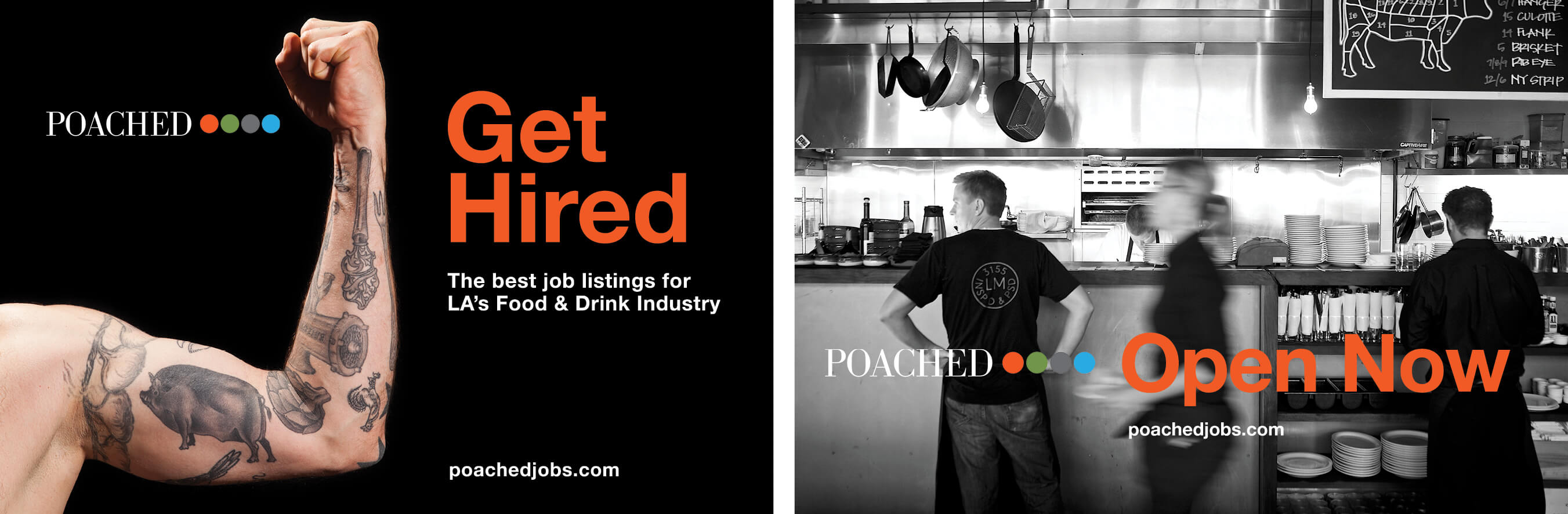
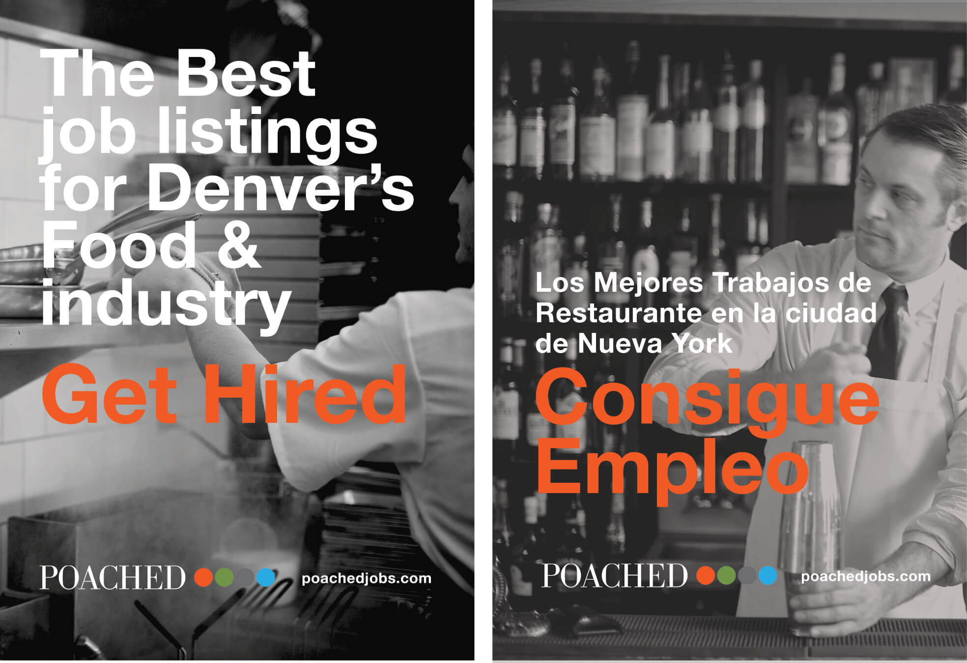
The food and drink businesses are very different from other industries. It’s built around relationships, hospitality and creativity. In addition, small businesses are by far the majority – 85% of restaurants are single units owned by a single operator. Because of this, it’s important that a restaurant focused jobs site reflects the values of the people in the industry. Craigslist lacks any real design – it’s not only difficult to use, but boring, uninspiring and lacks any connection to restaurant workers and employers. Poached, in contrast, is colorful, thoughtful and bold – just like the owners and workers it was designed to help.
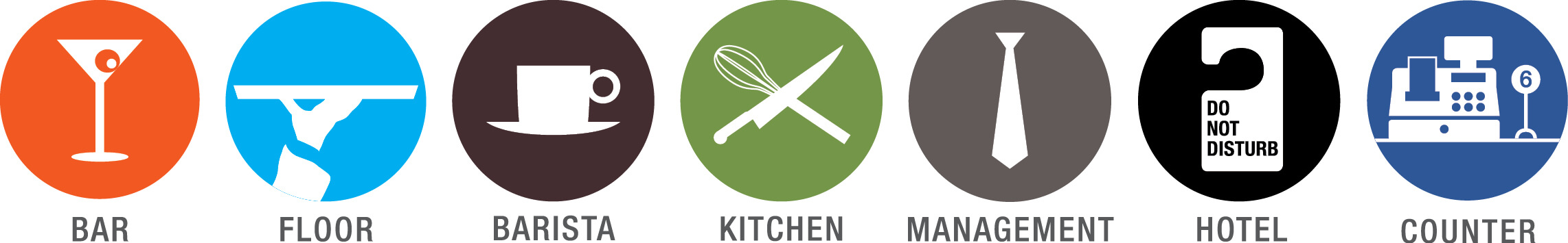
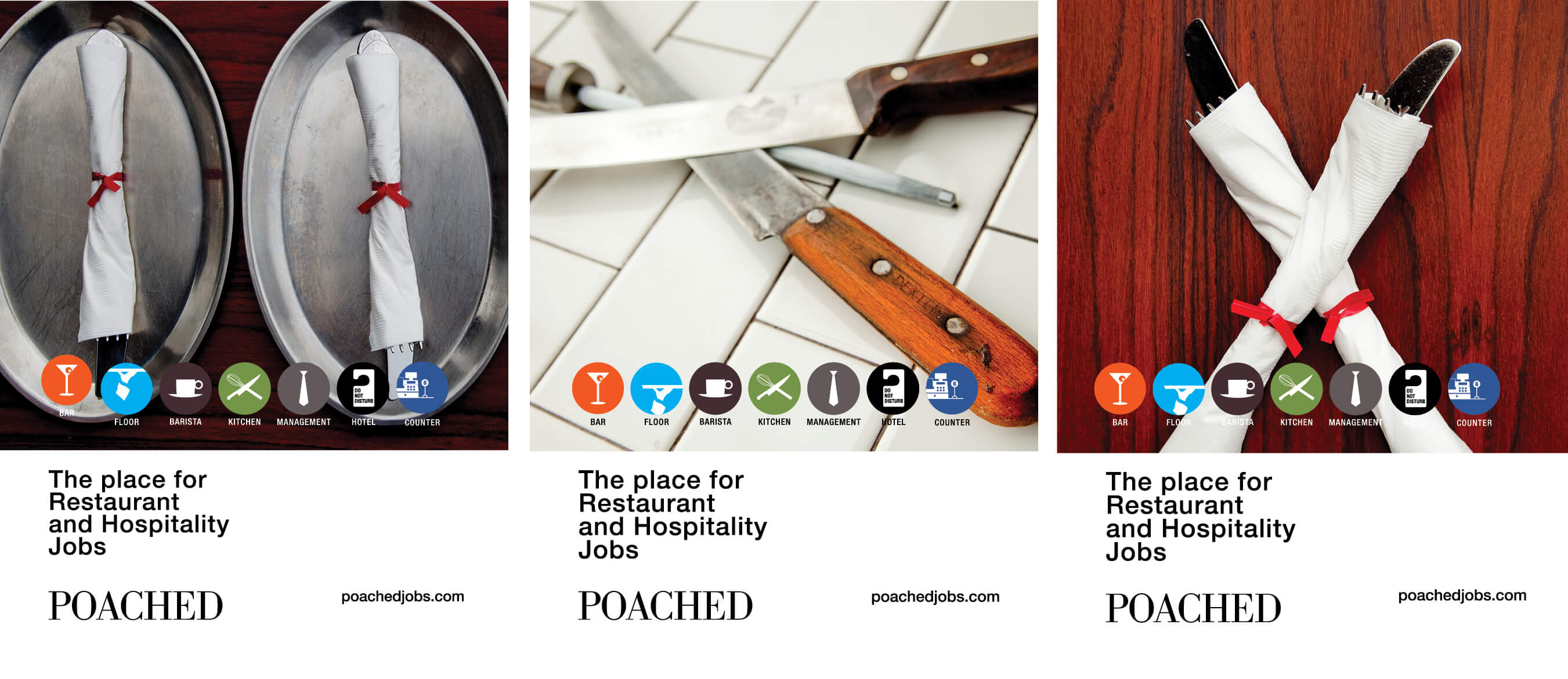
Chris worked with Kirk Thornby, a brand and design veteran, and Peter Bro, a successful restaurateur to design poachedjobs.com. We developed two key concepts: job tiles that allowed for quick browsing; and a color scheme that seeks to represents the different job categories found in the hospitality industry. Dangtran took the color concept a step farther and developed individual icons for each category – re-enforcing Poached Jobs’ organizational scheme and also the level of understanding needed to engage the trust of this niche audience. It also streamlines the hiring process for busy hiring managers with the Poached back office by providing a quick viewing dashboard that gives them all the relevant information about candidates in one screen. Simple, effective and concise allowing restauranteurs to get back to running their business. (they would never survive a corporate HR dashboard - we needed to give them just enough information to get the job done. Anymore and we would lose them. i.e., its designed around the users behavior not how many tools we can shove in front of them.