Bhutan's Vibrant Transformation: The Story Behind the New Image
On 23rd September 2022, Bhutan, a small mountainous kingdom nestled between India and China, reopened its borders after a period spanning over two years.
Bhutan is renowned for being the sole nation globally that prioritizes the happiness of its populace as a fundamental principle in shaping its philosophy. This unique approach was initiated in 1972 by Jigme Singye Wangchuck, the fourth king of Bhutan, who coined the term ‘Gross National Happiness’ (GNH) and began advocating for mental well-being.
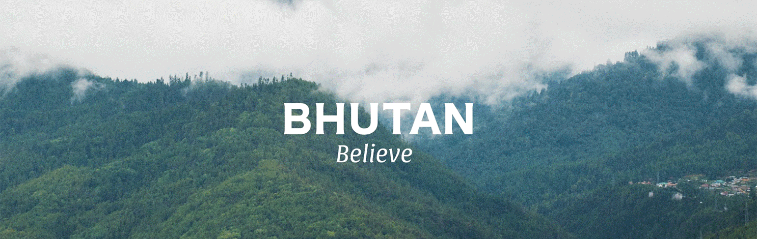
Recently, Bhutan has taken an additional progressive stride by unveiling a fresh national identity primarily focused on embodying a sense of hopefulness. The development of this new ‘brand’ was entrusted to MMBP & Associates, a London-based agency, with the specific mandate of crafting an entirely new image for the country, aiming to inspire a fresh perspective for its citizens. The resultant identity mirrors Bhutan’s essence, landscapes, history, and aspirations—bold, vibrant, deeply rooted in stories, and distinctly unique.
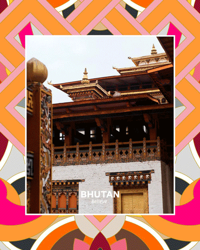
A crucial aspect of the plan involved devising a fresh visual representation of Bhutan— a modern interpretation of the nation’s heritage that could serve as a guide toward the future. This interpretation incorporates the lively yellow and orange hues found in Bhutan’s flag, and additionally, takes inspiration from nature’s color palette— the green reminiscent of cypress trees covering 70% of the country, the blue from Bhutan’s national flower, the Himalayan blue poppy, and a subtle black reminiscent of the natural soot produced by fires burning in the country’s hearths.
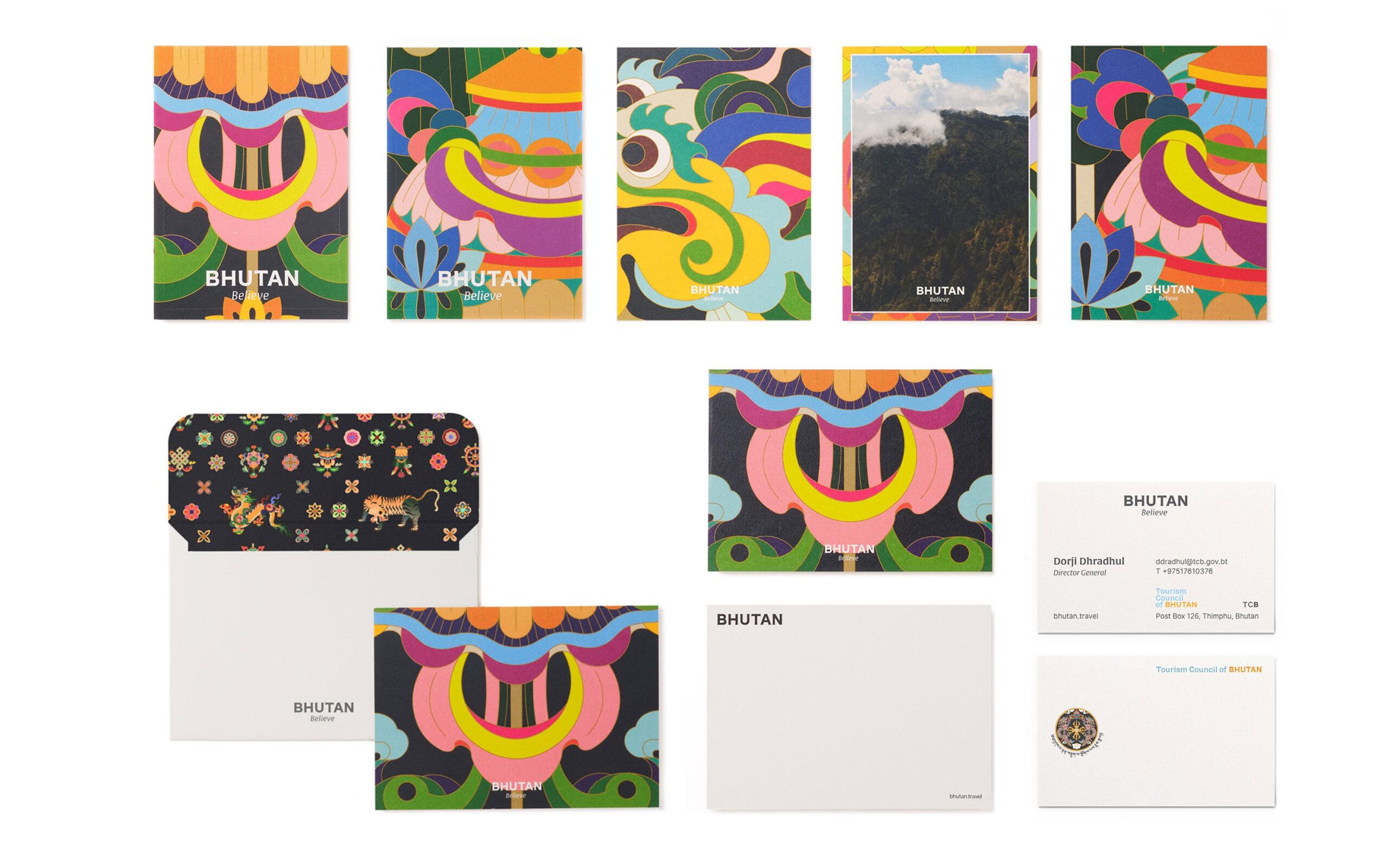
Leveraging these colors, MMBP proceeded to construct an entirely novel graphic identity system by integrating traditional Bhutanese symbols, including hand-painted architectural embellishments, mythical creatures, folklore, and symbolic elements. With the new tagline ‘Believe,’ the nation embarks on a renewed sense of possibility and belief in the future. “Far from the humdrum and the hectic, removed from hollow luxury and high pressure, Bhutan is proof that happiness, connection, respite and revelation are our birthright,” reads the official release on the philosophy behind the tagline. Balancing the visual aesthetics are the logotypes that revolve around these core concepts: bold and confident, contemporary and clear, traditional and warm, legible and scalable, and responsive and functional. This dynamic brand identity has already been introduced within the tourism sector and has received high praise.
Narrating the creative process behind the rebranding of Bhutan, Managing Director of MMBP & Associates, Julien Beaupre Ste-Marie shares, “The learnings we made working alongside such an inspired group of Bhutanese people and international stakeholders will influence how we work for years to come. Similarly, as the world wakes up to the damaging effects of unrestricted mass tourism and tries to find ways to mitigate climate change, this small and mighty country has many lessons to share with the world. Our hope is that our work and our brand help to carry this vision forward.”
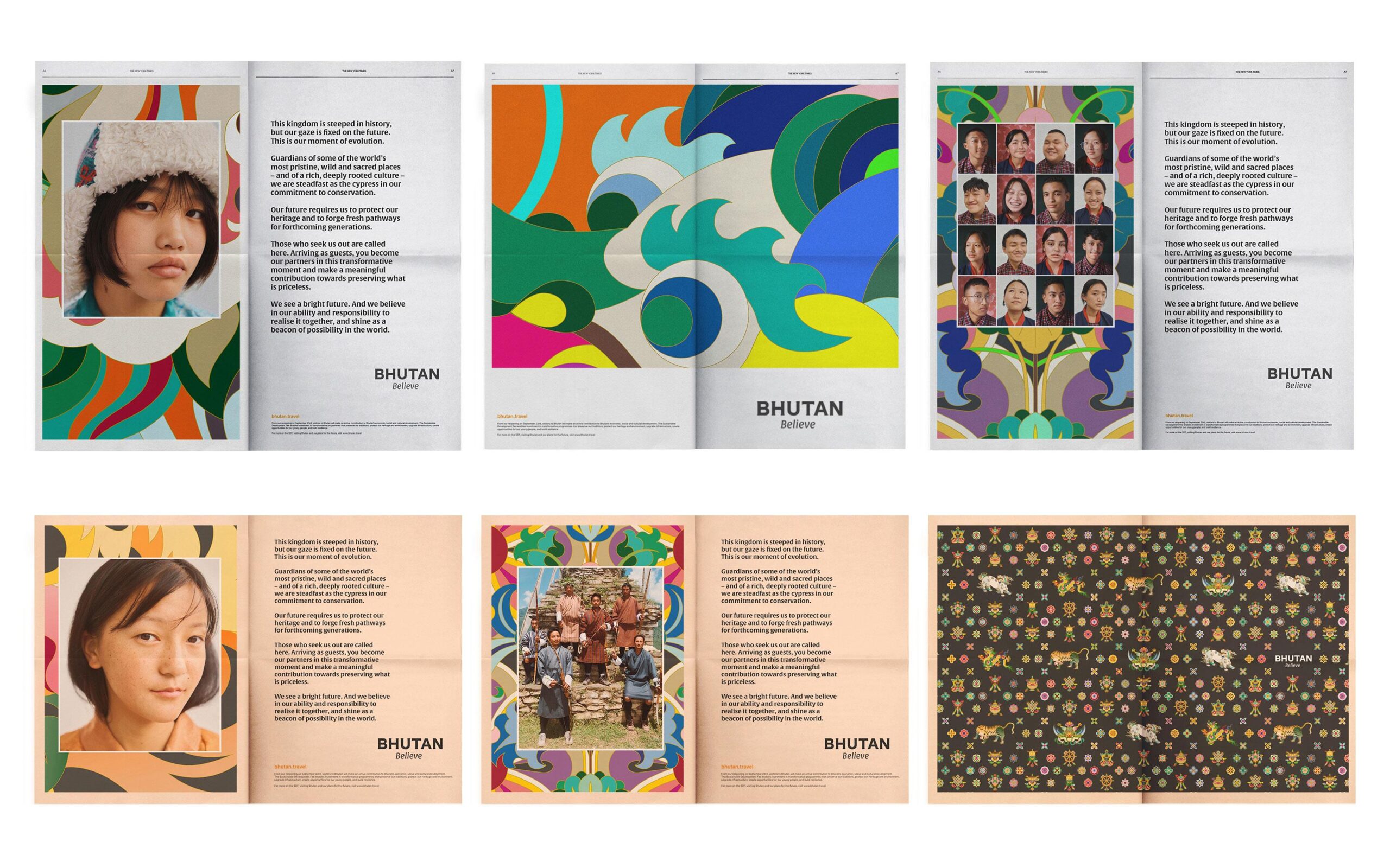
This dynamic brand identity has already made waves in the tourism sector, garnering well-deserved acclaim. It is poised to permeate various facets of Bhutan’s official landscape, reinforcing a clear and inspiring vision for the nation. As Bhutan continues to evolve and embrace its unique identity, this rebranding stands as a testament to the country’s determination to carve out a promising and optimistic future for its people.
Client
Brand
Nation Brand Bhutan
Design Agency
Country