The Art of Holiday Windows: When Less becomes More

In the rush of holiday decor, windows often compete to be loud. But what if the most compelling ones don’t shout, but whisper?
#Imagery & Video #Marketing communications #Eyes on Design

The holiday rush is here, and with it comes the pressure to create something spectacular. This season, a store window must do more than decorate; it needs to capture a glance, tell a story, and invite someone in from the cold. The instinct is to fill every inch with festive cheer, believing that more is more.

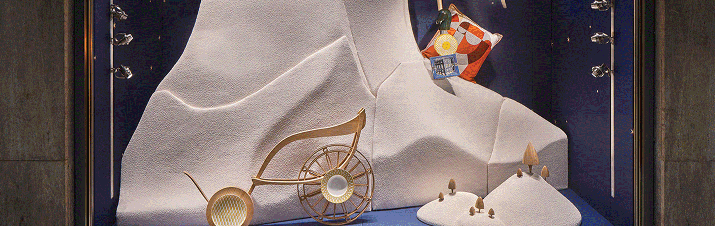
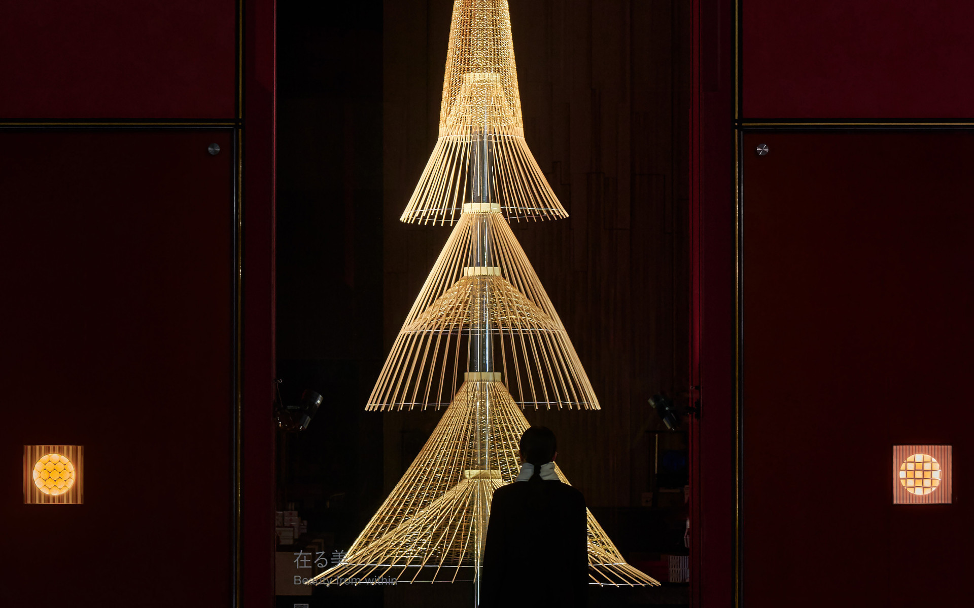
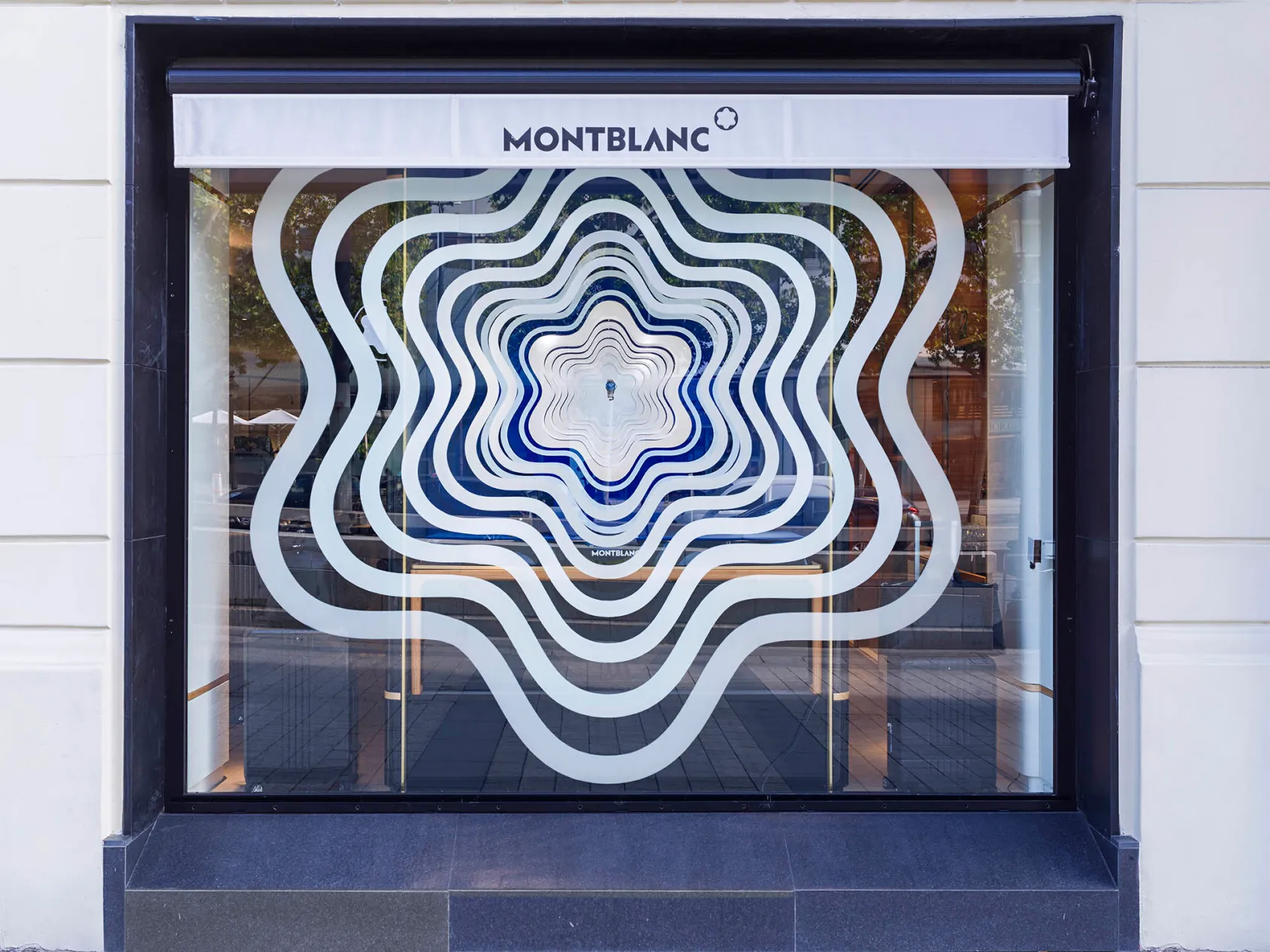
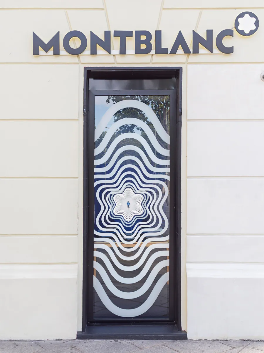
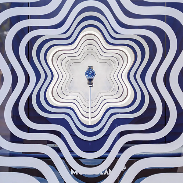
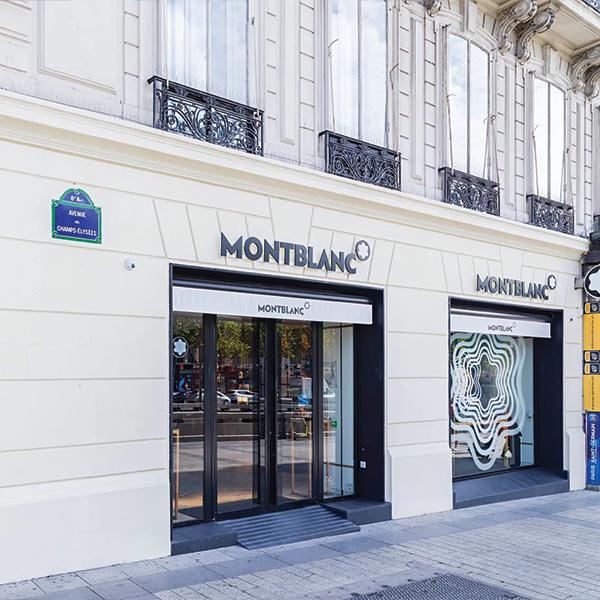
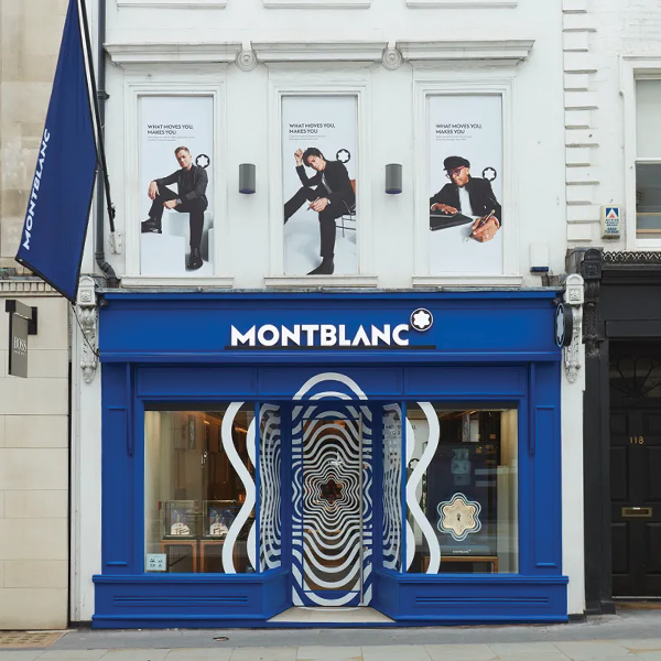
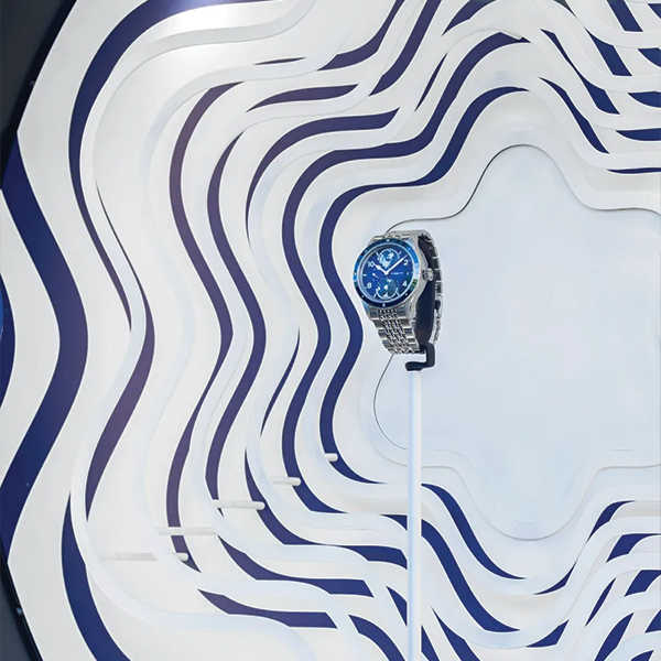
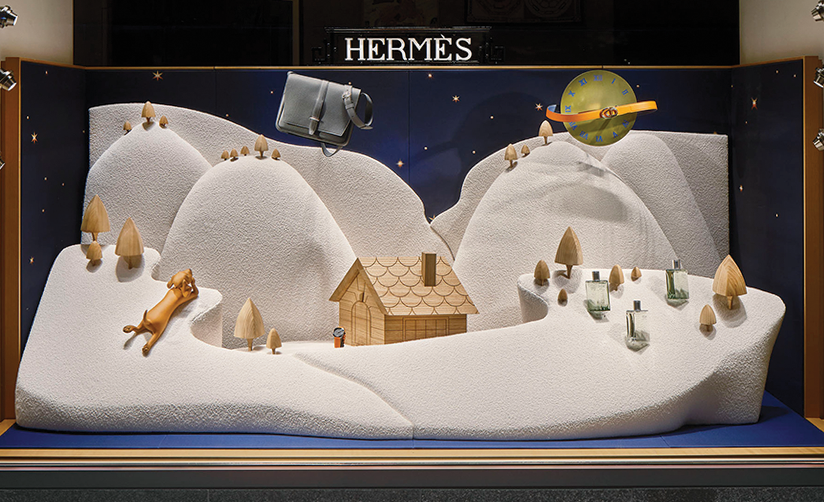
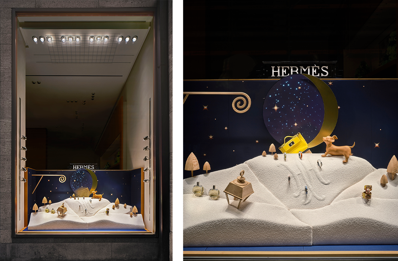
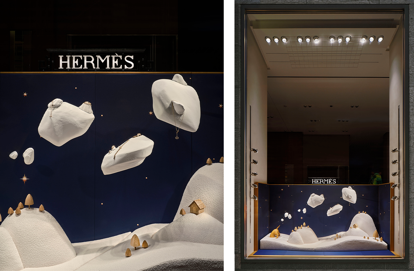
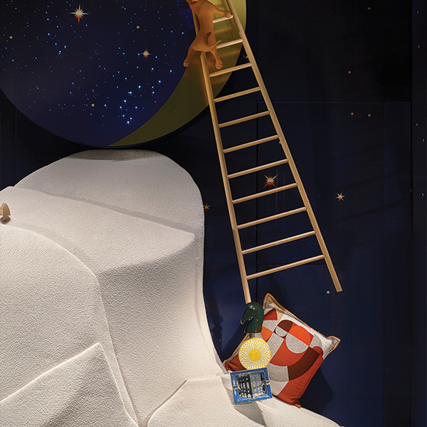
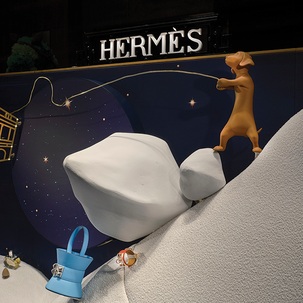
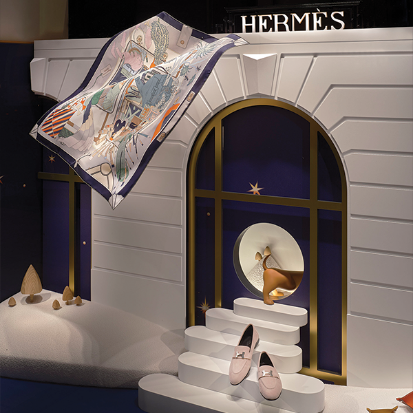
Yet the most compelling holiday windows often speak in a whisper, not a shout. This is the power of strategic simplicity: a thoughtful approach that creates a moment of calm and initiates a dialogue. It conveys quality and confidence, resonating with customers seeking something genuine amidst the seasonal noise.
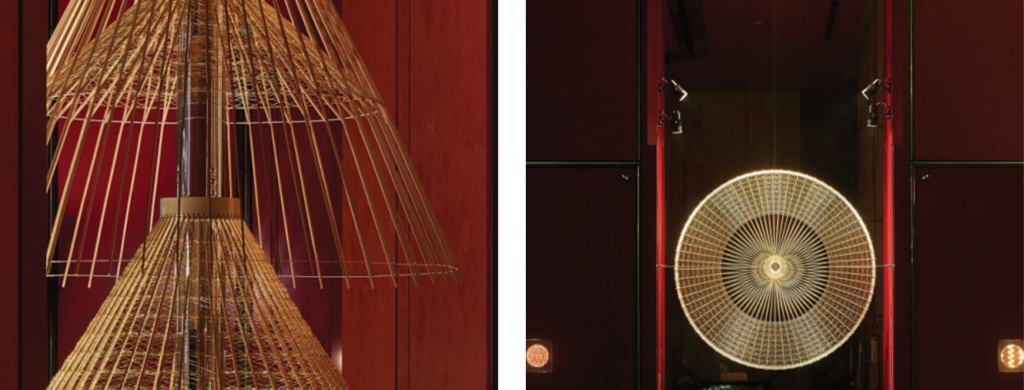
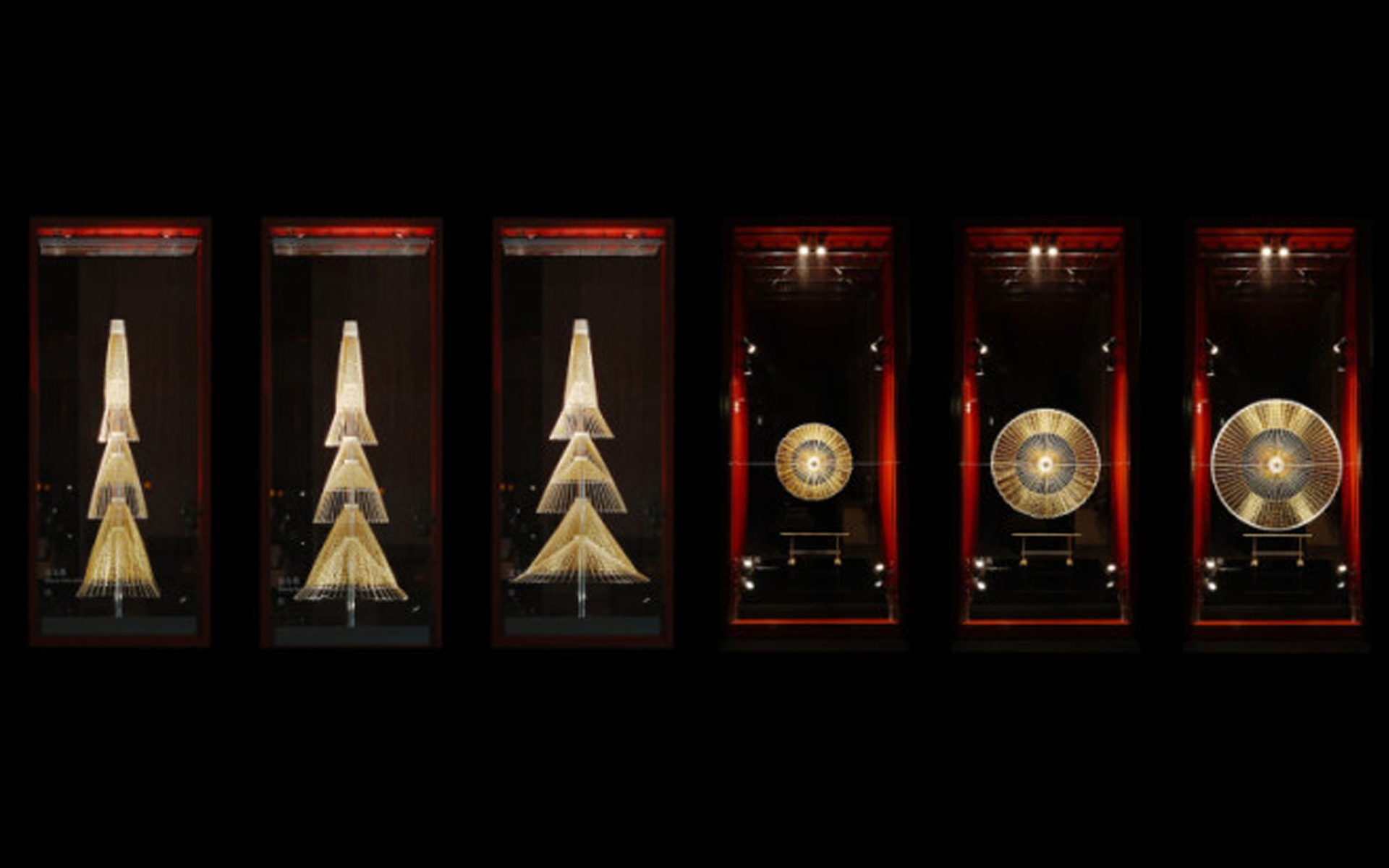
Now let’s look at how some brands have mastered this, not with flat graphics, but with tangible, elegant installations.

Case 1: Verizon & the Language of Shape

Image source: https://gschottelkotte.com/Verizon-Holiday

The concept centered on a single, flowing ribbon in the brand’s signature red. It nodded to the tradition of holiday gifting while representing a connected tech network. The genius was in its restraint. The clean, white backdrop and the ribbon’s fluid line framed the products as natural, connected gifts. The visual flawlessly reinforced Verizon’s core message: “A gift is only as good as the network it’s on.”


Case 2: Shiseido & the Depth of Material

Image source: https://frameweb.com/article/retail/a-shiseido-holiday-window-display-puts-a-spotlight-on-traditional-japanese-craft


Shiseido shifted the focus from decoration to craftsmanship. Their windows featured exquisite, three-dimensional forms made from traditional washi paper. The beauty lay in the texture, the light filtering through the delicate layers, the quiet artistry of it. This approach traded glitter for substance, telling a deeper brand story. It felt luxurious precisely because it was understated and authentic.

Case 3: Montblanc & the Strength of an Icon

Image source: https://studioxag.com/work/montblanc-1858/

Montblanc placed its snowcap emblem at the center of the 1858 campaign, turning it into a soft, illuminated form that frames the products with ease. The windows felt quietly premium in a signature deep blue, drawing on the brand’s mountain heritage without overstatement. At flagships, the pattern expanded across entire façades. Luxury was then expressed through clarity and restraint rather than spectacle.


Case 4: Hermès & the Poetry of Form and Balance

Image source: https://www.belepok.com/project/hermes-window-display-christmas-2024

Hermès understands the quiet power of simple storytelling. In a 2017 display in Japan, a horse-shaped design crafted from elegant letterforms was displayed on a diamond backdrop, capturing the brand’s classic spirit in a fresh, minimalist way. In winter 2024, Hermès returned to 24 Faubourg Saint-Honoré, where the house dog wandered through soft, snowy scenes with a calm sense of wonder.The magic lies in unexpected balance, craftsmanship, and the quiet confidence of objects that carry stories.


In a moment of sensory overload, simplicity is a gift. This isn’t about a lack of creativity or spirit, but a strategic decision. It’s the art of creating depth through focus and impact through intention. This holiday, the most memorable statement might just be the simplest one.

MORE INSIGHT

Imagery & Video, Marketing communications (+1)
Art, Culture (+4)
Identity, Eyes on Design (+1)