Although widely used fonts such as Arial, Times New Roman, and Helvetica remain reliable choices, exploring distinctive font combinations can give your website a stronger visual identity. In web design, fonts are not merely functional—they act as expressive design elements that communicate brand personality and contribute to a refined, engaging interface.
What do you want your font to say?
While the scope of your project can help narrow your font choices, keep in mind that there are no hard and fast rules for defining the right aesthetic. Font selection is closely tied to personality, which is often influenced by familiarity.
Many apps and websites still rely on a small set of common fonts, a remnant of earlier digital typography practices. While system fonts were once the safest choice, today there’s no need to settle for a generic “workhorse” font, as web fonts are equally reliable and offer far greater variety.
If standing out is a priority, exploring less common web fonts or investing in commercial typefaces can help create a more distinctive visual identity. Choosing newer font releases is also an effective way to avoid overused styles.
Some type fonts for website design
1. Inter
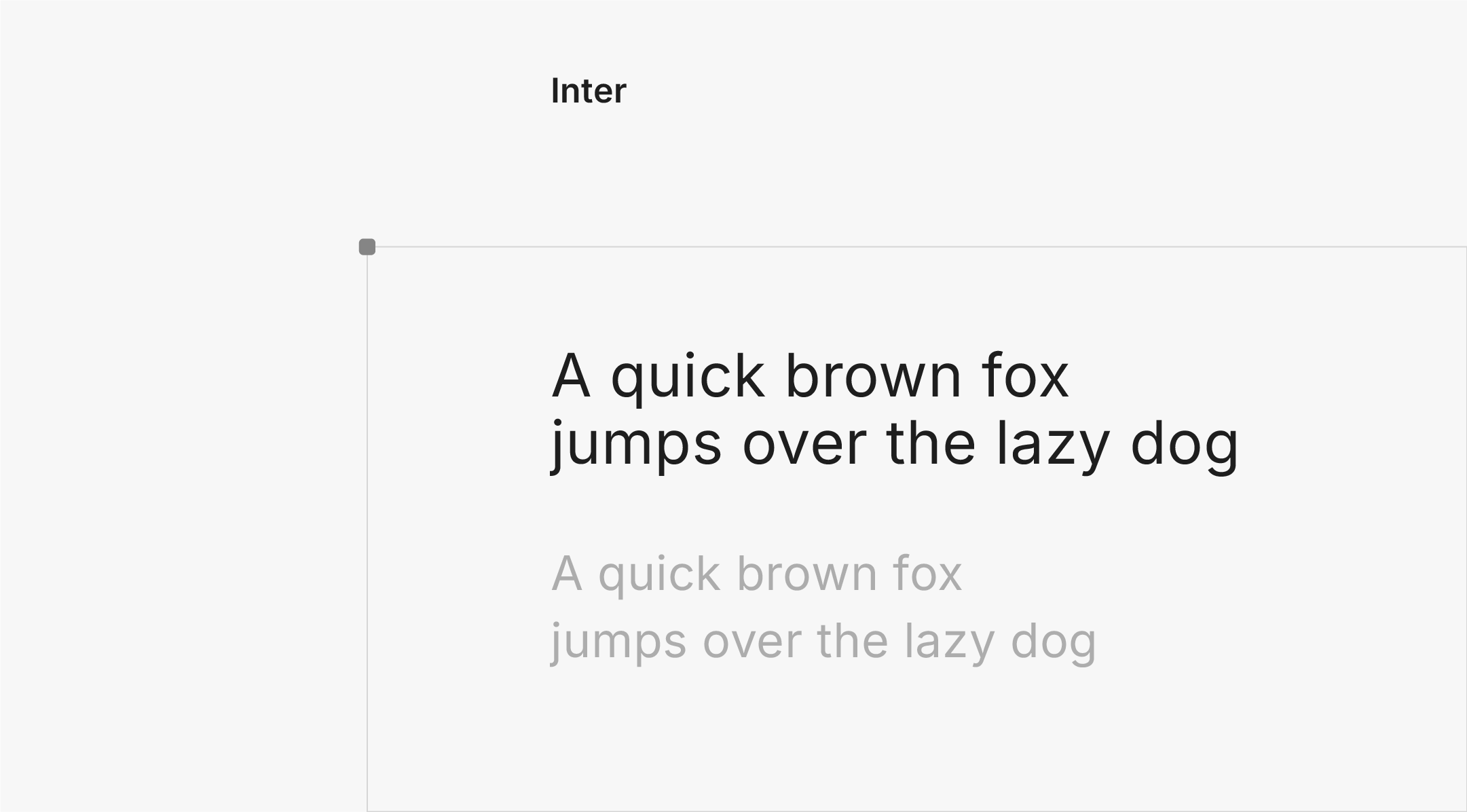
Font type: Sans serif
Inter is a sans-serif typeface designed by former Figma designer Rasmus Andersson. It’s a free, open-source font made specifically for user interfaces and screens— even major companies like GitHub and Mozilla use it. Inter is a variable font family, allowing more flexibility and control over the style and weight you need. It also includes OpenType features, like contextual alternates and tabular numbers, that automatically adjust in different situations to improve readability.
1. Roboto
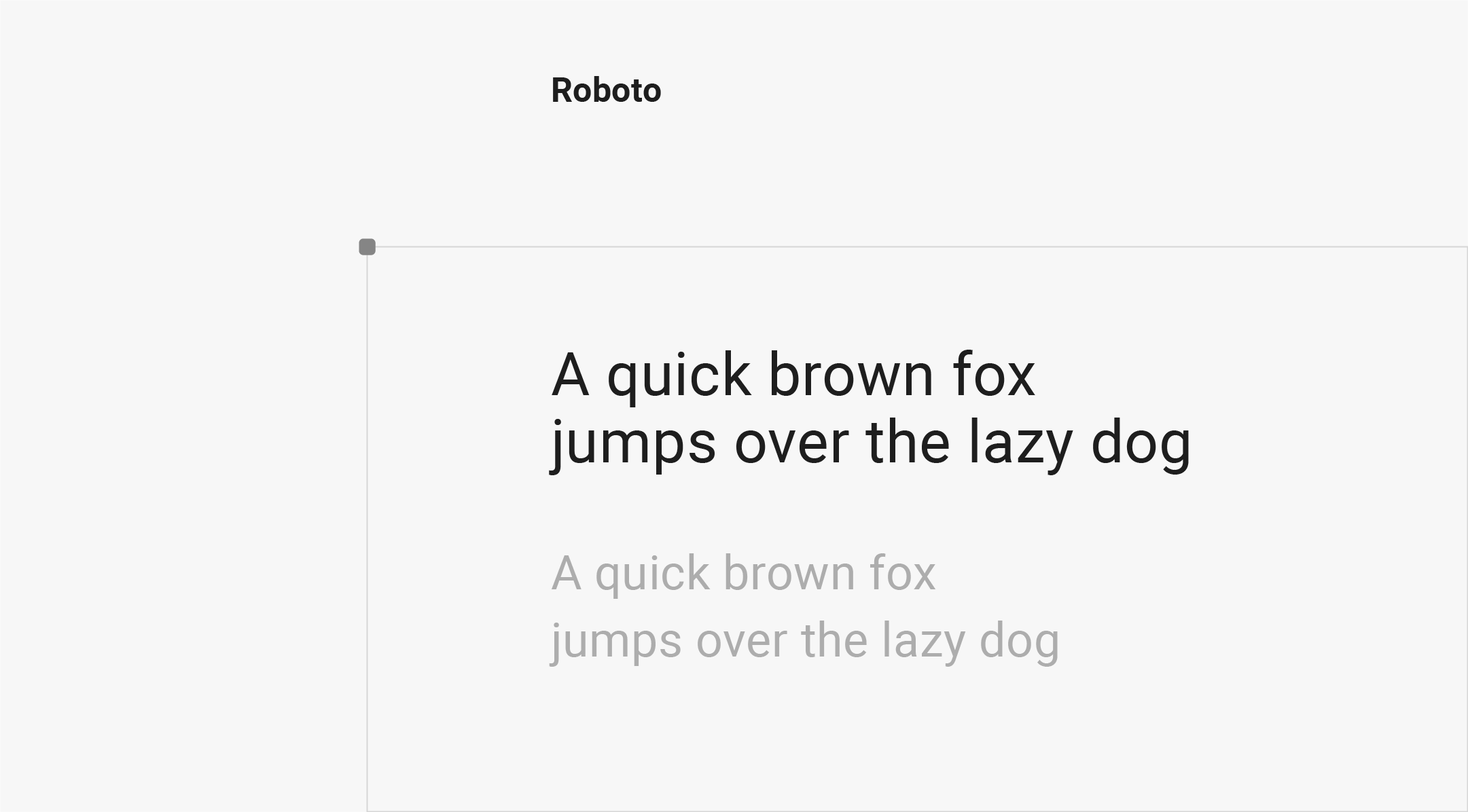
Font type: Sans serif
Roboto is a Web-safe font initially designed by Google to replace the Droid font used across Android operating systems. As a neo-grotesque sans serif font, it’s known for its minimalistic design and comes in many styles, widths, and weights. Thanks to its simplicity, Roboto is easily readable across any screen, making it one of the most popular choices for Web design, whether used in headers, logos, CTA buttons, or body text.
3. Open sans
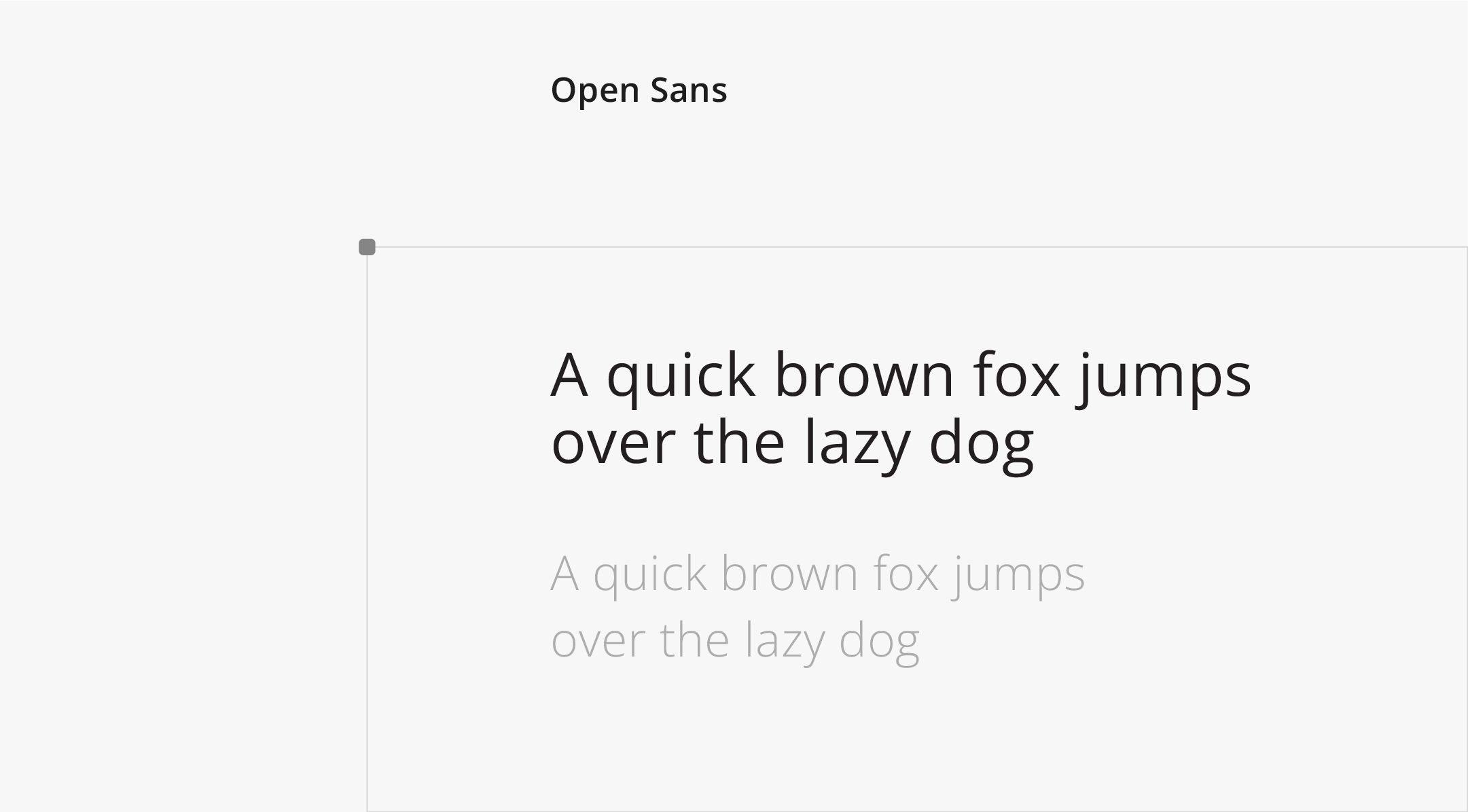
Font type: Sans serif
Open Sans is a humanist sans-serif font with a clean, simple, and friendly design style. Created by American typeface designer Steve Matteson, who also designed the Microsoft font family Segoe, Open Sans is one of the best fonts for websites because it’s optimized for Web and mobile interfaces, and its straight, upright shape is designed with readability in mind. It also supports various languages to ensure a consistent experience for global users.
4. Nunito
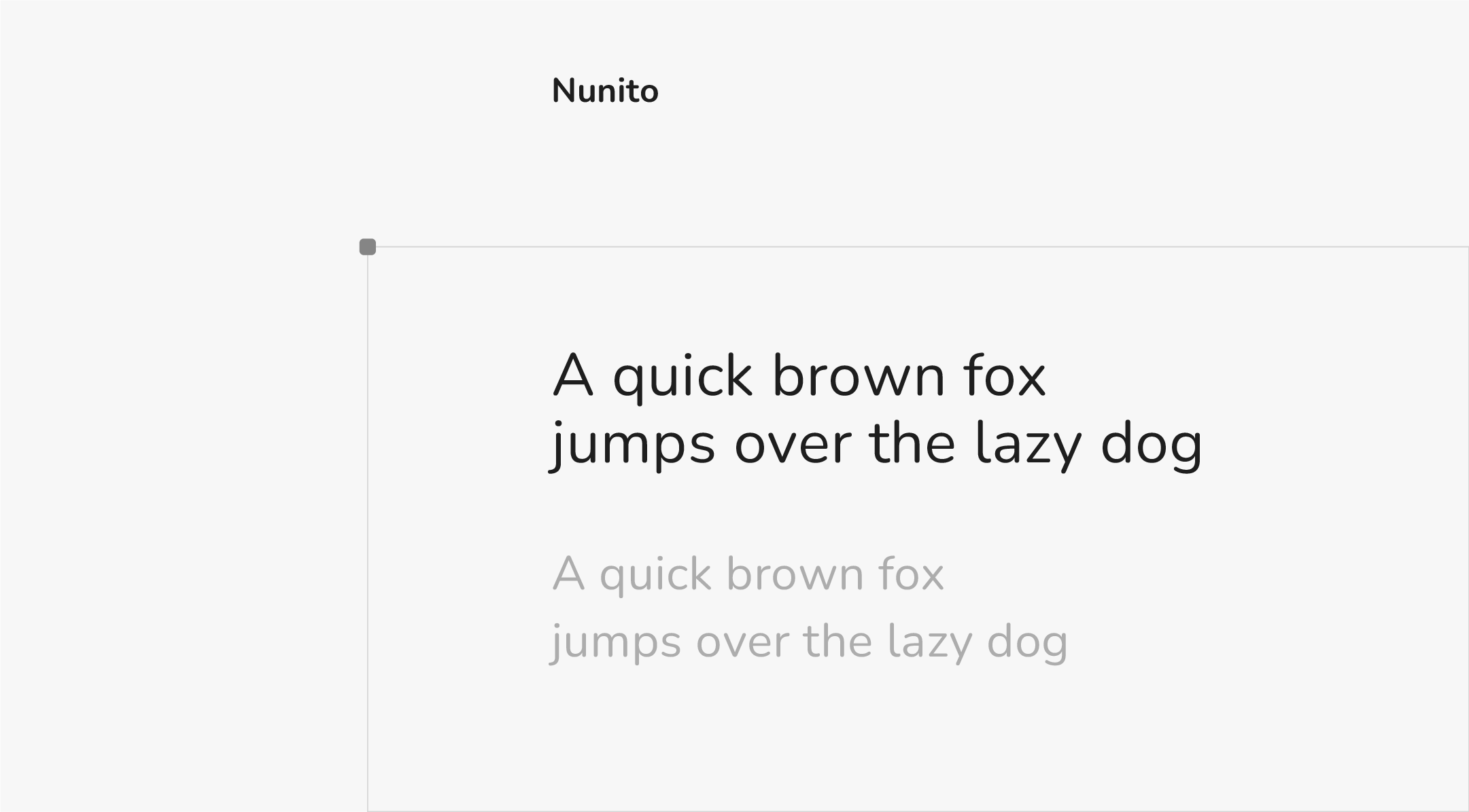
Font type: Sans serif
Nunito is a rounded terminal sans-serif font created by the late typographer Vernon Adams. Its thin and harmonious stroke widths are easily readable across the body and display text, creating an inviting atmosphere. Nunito is available in multiple font weights, from light to extra bold, and the font family also includes Nunito Sans, a non-rounded terminal version of the popular typeface.
5. Poppins
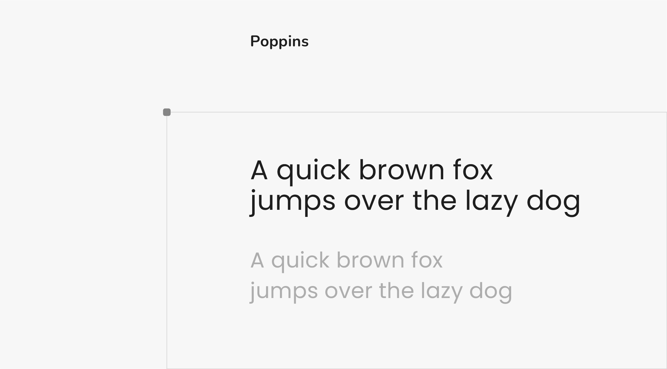
Font type: Sans serif
Poppins is a contemporary font developed by Indian Type Foundry. This geometric sans serif typeface features sleek curved edges and consistent line thickness to give a cohesive look. Poppins’ proportional spacing makes it versatile for different text sizes, from headers to body copy, ensuring proper readability across Web pages. The Poppins font family also supports Devanagari and Latin languages, helping you create a consistent user experience for international websites.
6. Josefin Sans
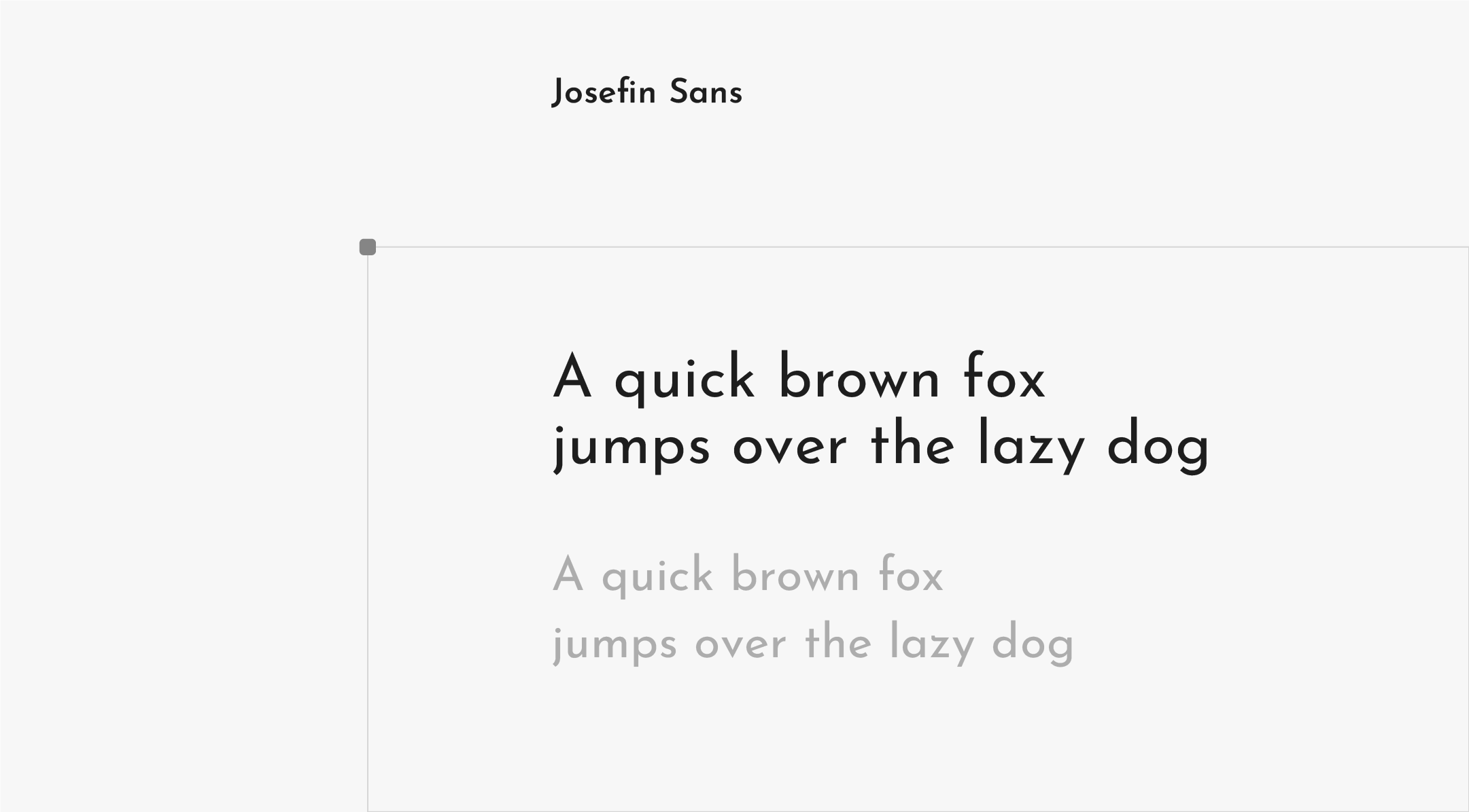
Font type: Sans serif
Josefin Sans is a geometric sans serif font crafted by type designer and engineer Santiago Orozco. Inspired by the sans serif fonts of the 1920s, like Rudolf Koch’s Kabel and Paul Renner’s Futura, Josefin Sans is known for its elegant, vintage style with a modern flair. It’s best used for larger text, making it an excellent choice for headings and subheadings, while its tasteful look is well-suited for brands looking to convey a sense of luxury and sophistication
7. Rubik
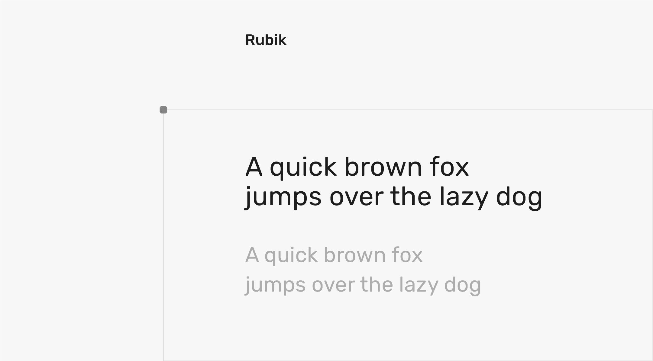
Font type: Sans serif
Rubik is a sans-serif font created by Phillip Hubert and Sebastian Fischer of HFS Studio. This open-source typeface has slightly rounded edges and gets its name from the Rubik’s cube, as it was originally commissioned as a part of the Chrome Cube Lab project. The Rubik font family comes in five different weights and includes Roman and italic styles. Its bolder style makes it a great option for headers, titles, logos, or other display text, while the regular weight is perfect for body text thanks to its readability and clean design.
8. DM Sans
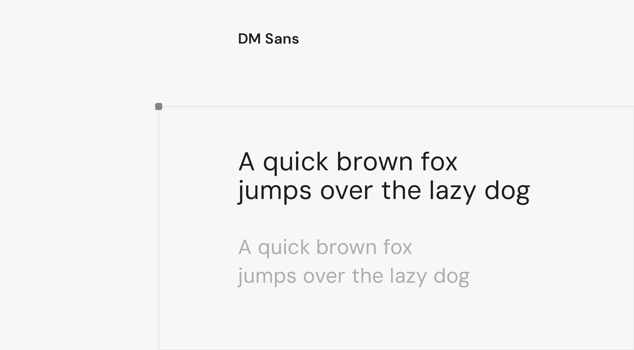
Font type: Sans serif
Colophon Foundry created DM Sans and originally designed it with smaller text sizes in mind, making it another great option for on-screen text. While it’s often used in body copy for its legibility, its geometric style and clean lines offer a friendly yet sophisticated look, ideal for buttons, logos, and headings. Plus, DM Sans also includes a Latin Extended glyph set to support both English and Western European languages.
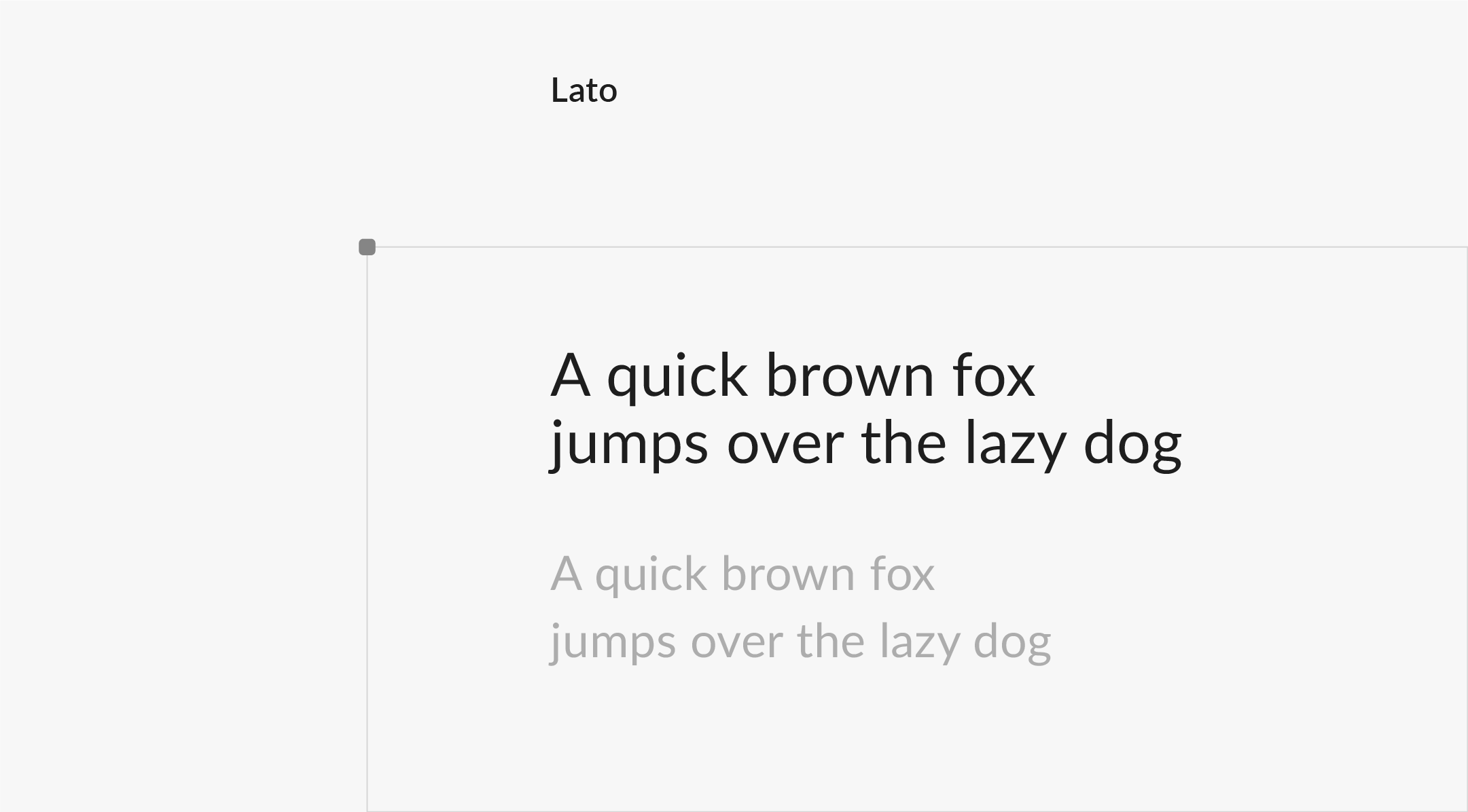
9. Lato
Font type: Sans serif
Lato is an open-source sans-serif font created by Poland-based designer Łukasz Dziedzic. When developing Lato, Dziedzic wanted to create a distinct difference between small and large text while maintaining harmony. He used traditional proportions for the letters but added his own flair to make the text stand out. Lato is often described as warm and elegant and is ideal for websites that want to convey information in a friendly and approachable way.
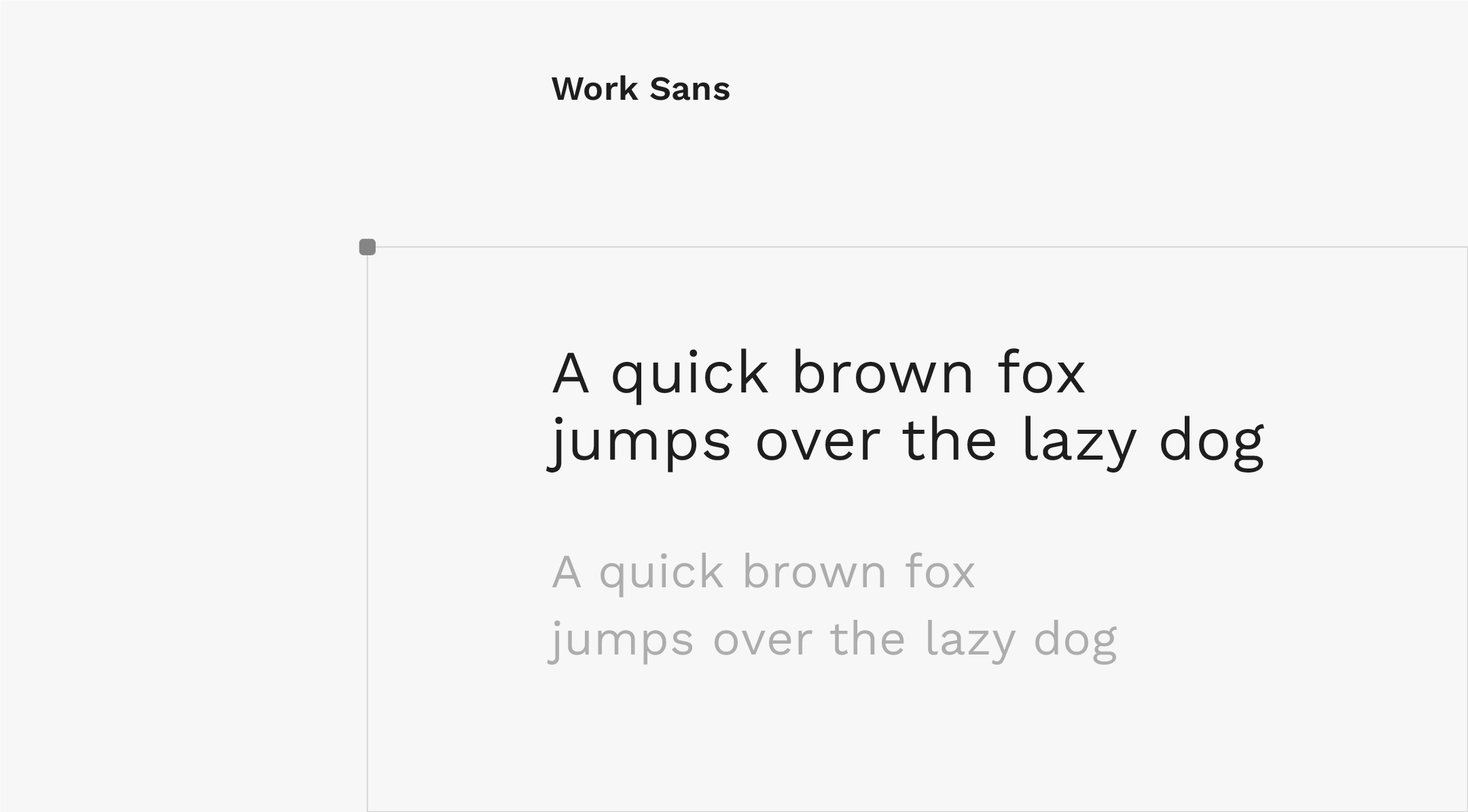
10. Work Sans
Font type: Sans serif
Australian type designer Wei Huang created Work Sans in 2015, drawing inspiration from early grotesque typefaces. It’s designed for Web use and optimized to maintain high legibility across all devices. Work Sans is a nine-weight type family. The regular weights are best used for on-screen text ranging from 14px to 48px, while the heavier-weighted styles work well for display text. Work Sans’ simple geometric style is highly versatile and timeless, making it one of the best fonts for websites.