Helvetica: The Timeless Typeface
Helvetica – the epitome of timeless typography that has graced countless designs, from subway signs to corporate logos. Its clean, sleek lines and unwavering simplicity have earned it a revered spot in the design world. Let’s take a journey into the depths of Helvetica, understanding its roots, characteristics, and enduring influence on design.
The Genesis of Helvetica
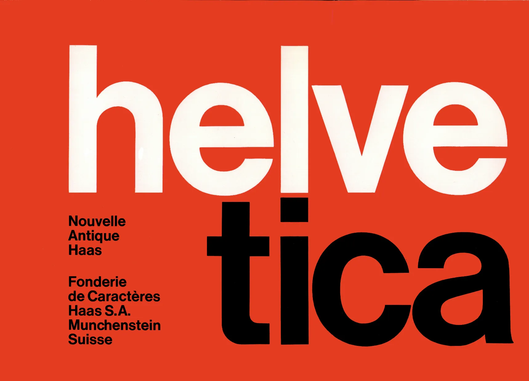
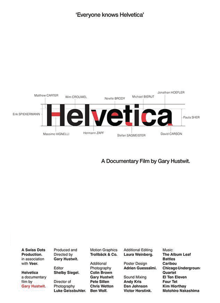
Helvetica was conceived in 1957 by Swiss typeface designers Max Miedinger and Eduard Hoffmann. Originally named Neue Haas Grotesk, it was designed as a neutral, easily readable typeface to meet the needs of modern communication. Its name changed to Helvetica in 1960, a homage to “Helvetia,” the Latin name for Switzerland, a nation synonymous with precision and modernity.
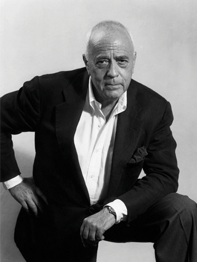
Max Miedinger (1910–1980)
The Designer of Helvetica. Miedinger was the Swiss graphic designer who created the iconic typeface, initially named Neue Haas Grotesk, in 1957.
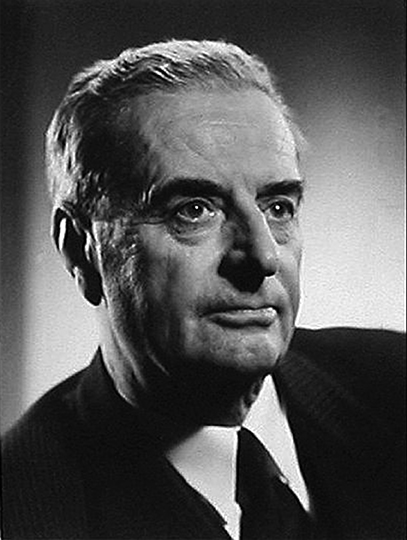
Eduard Hoffmann (1892–1980)
The Commissioner. Hoffmann was the Director of the Haas Type Foundry who initiated and oversaw the creation of the typeface that would later be renamed Helvetica in 1957.
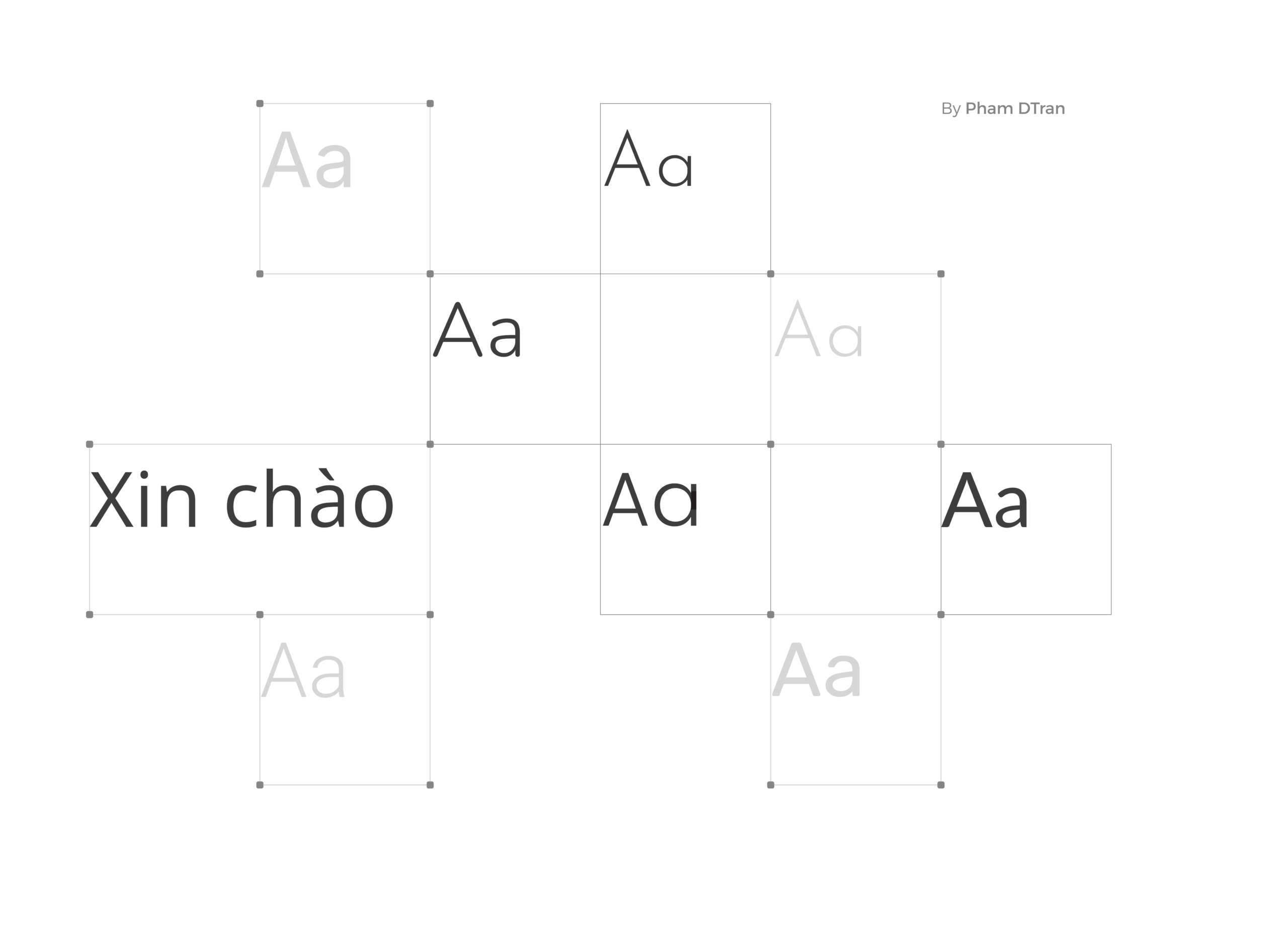
The Design Aesthetic
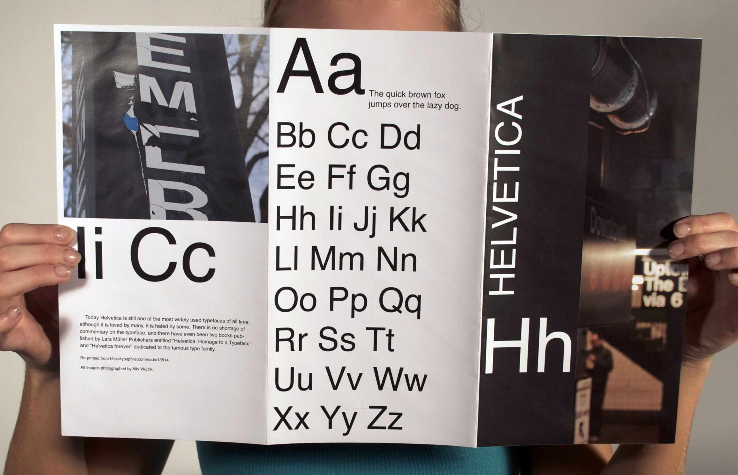
Helvetica’s beauty lies in its simplicity. Its characters are sans-serif, devoid of decorative strokes or ornaments, embodying a minimalist and clean design. The font is characterized by even stroke width, uniform spacing, and a neutral appearance. Its letters are easy to read, making it versatile for a wide array of applications.
Versatility at Its Core
One of Helvetica’s significant advantages is its versatility. It works seamlessly across different mediums – print, web, signage, and more. The typeface’s adaptability to varying sizes, weights, and styles, while maintaining its clarity and legibility, has contributed to its widespread usage.
Helvetica's Ubiquity
Influence on
Contemporary Design
Over the decades, Helvetica has maintained its relevance, inspiring generations of designers. Its design principles of simplicity, clarity, and timelessness have influenced many contemporary fonts. Helvetica’s impact is evident in today’s digital landscape, where it remains a go-to choice for designers seeking a balance between style and functionality.
Helvetica is more than just a font; it’s a cultural icon and a symbol of modern design. Its enduring appeal stems from its ability to convey a message with clarity and elegance. Whether in branding, advertising, or everyday communication, Helvetica has stood the test of time and will likely continue to do so, leaving an indelible mark on the world of typography.
In the present day, Helvetica remains an immensely popular choice for commercial use. Prominent brands such as BMW, General Motors, Kawasaki, Knoll, Kroger, Lufthansa, Motorola, Nestlé, Skype, Microsoft, and Apple have harnessed its versatility. Not only commercial entities, but governmental bodies like the U.S. government, NASA, the Canadian government, the European Union, New York City, and Madrid Metro also extensively utilize this ubiquitous typeface.
In conclusion, Helvetica’s legacy as a timeless, versatile, and influential typeface is a testament to the power of design to transcend generations and captivate the world.